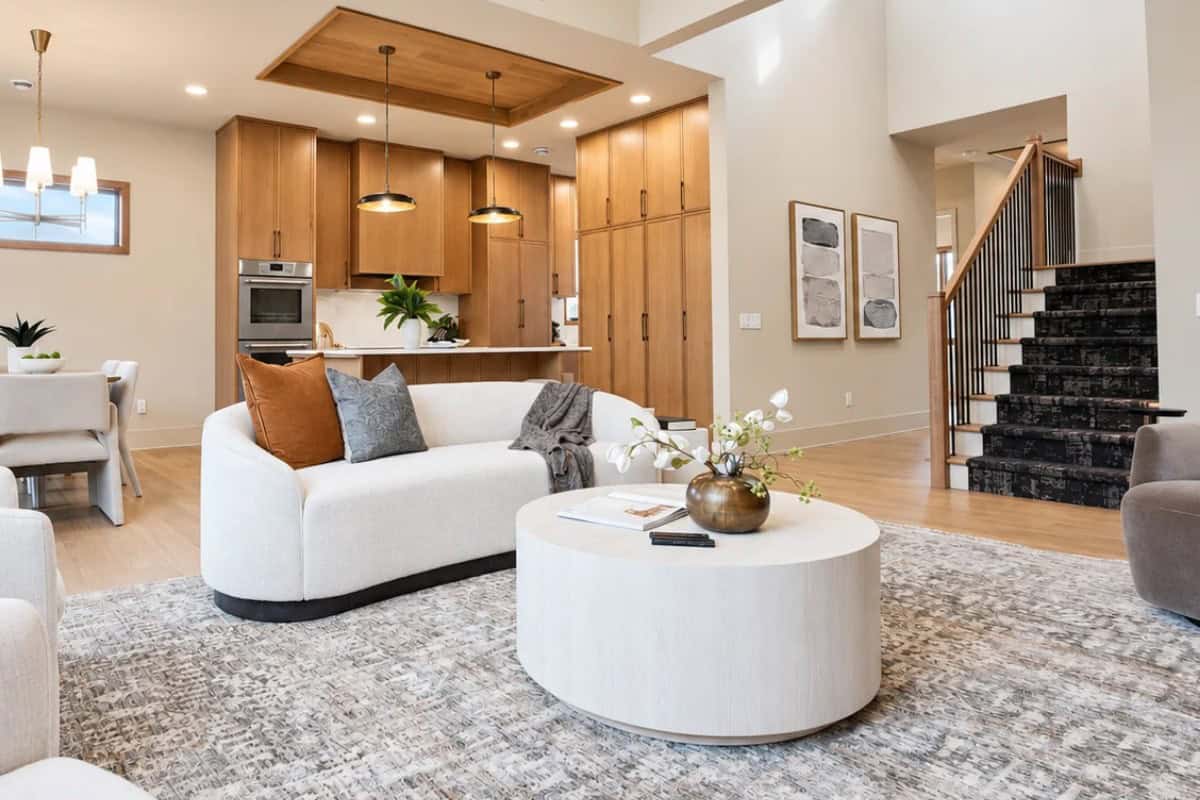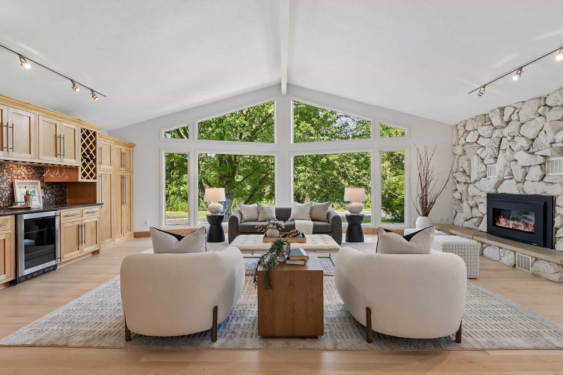
Spring and summer are some of the busiest seasons here at Rooms With Style, and one of the most common questions we hear from homeowners is, “What paint color should I choose?”
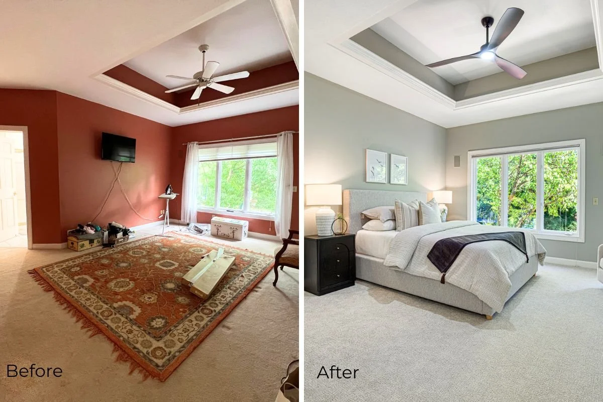
While furnishings, accessories, and layout all play important roles in creating a beautiful home, few updates can transform a space as dramatically—or as affordably—as a fresh coat of paint. The right paint color can make a room feel brighter, larger, warmer, and more inviting. It can also help create a cohesive flow throughout the home, which is something both homeowners and potential buyers appreciate.
While there are many excellent paint brands available, the colors featured in this article are all from Sherwin-Williams. You can always have paint colors matched at your local favorite paint store.
When preparing a home for sale, we often recommend lighter paint colors with warm, neutral undertones. These shades appeal to a broad range of buyers and create a light and fresh backdrop that allows them to envision their own furniture, décor, and personal style in the space.
Before we share our favorite paint colors of 2026, let’s cover two important factors that can make all the difference when selecting paint: LRV and undertones.
Understanding LRV (Light Reflectance Value)
If you’ve ever painted a room and wondered why it felt darker than expected, LRV may be the reason.
LRV, or Light Reflectance Value, measures how much light a paint color reflects. The scale ranges from 0 to 100, with 0 being pure black and 100 being pure white.
In general:
- LRV 0–20: Dark colors
- LRV 20–50: Medium-depth colors
- LRV 50–80: Light colors
- LRV 80+: Very light colors and whites
As home stagers, we often gravitate toward colors in the 60-85 LRV range because they help spaces feel brighter, larger, and more welcoming. While darker colors certainly have their place, lighter neutrals tend to appeal to the widest range of buyers and showcase a home’s best features.
Don’t Forget About Undertones
Two paint colors may look nearly identical on a paint chip, but once they’re on the wall, the undertones can tell a very different story.
Undertones are the subtle colors that live beneath the main color. A beige paint may have pink, yellow, green, or gray undertones. A white paint may lean creamy, greige, or even slightly blue.
Lighting, flooring, cabinetry, countertops, furnishings, and even the direction a room faces can dramatically influence which undertones become visible. This is why a color that looks perfect online or in a friend’s home may look completely different in yours.
Before committing to any paint color, we always recommend sampling it in the actual room and observing it throughout the day. Morning, afternoon, and evening light can all reveal different aspects of the same color.
This year, we’re especially excited about several newer colors from the Sherwin-Williams Designer Color Collection. The Designer Collection features a curated palette of sophisticated colors created to offer more depth, nuance, and complexity than many traditional paint selections. Alongside these newer favorites, we’re also sharing a few of our long-time go-to colors that continue to perform beautifully year after year.
Our Favorite New Neutrals from the Sherwin-Williams Designer Color Collection
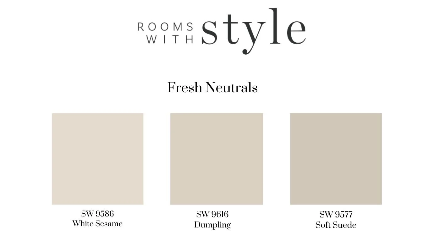
White Sesame
White Sesame is a beautiful light neutral that strikes the perfect balance between warm and fresh. It feels brighter than many traditional greiges while avoiding the starkness that can sometimes come with cooler whites.
This is an excellent whole-home color for homeowners looking to create a clean, welcoming backdrop that works with a variety of decorating styles.
Dumpling
Dumpling is a soft, creamy neutral that feels both elegant and approachable. It has just enough warmth to create a welcoming environment while still keeping spaces feeling light and airy.
For homeowners who find many whites too stark and many beiges too dark, Dumpling lands beautifully in the middle.
Soft Suede
Soft Suede is one of our favorite discoveries this year. This warm, sophisticated neutral offers a little more depth than a traditional beige while still feeling timeless and versatile. It creates a cozy atmosphere without making a room feel dark or heavy.
We especially love it in living rooms, dining rooms, and primary bedrooms where warmth and comfort are the goal.
Looking for a Little More Personality? Designer Collection Colors with a Hint of Color
While neutrals will always be our first recommendation for broad buyer appeal, we’re seeing more homeowners embrace subtle, nature-inspired colors that still feel timeless and sophisticated.
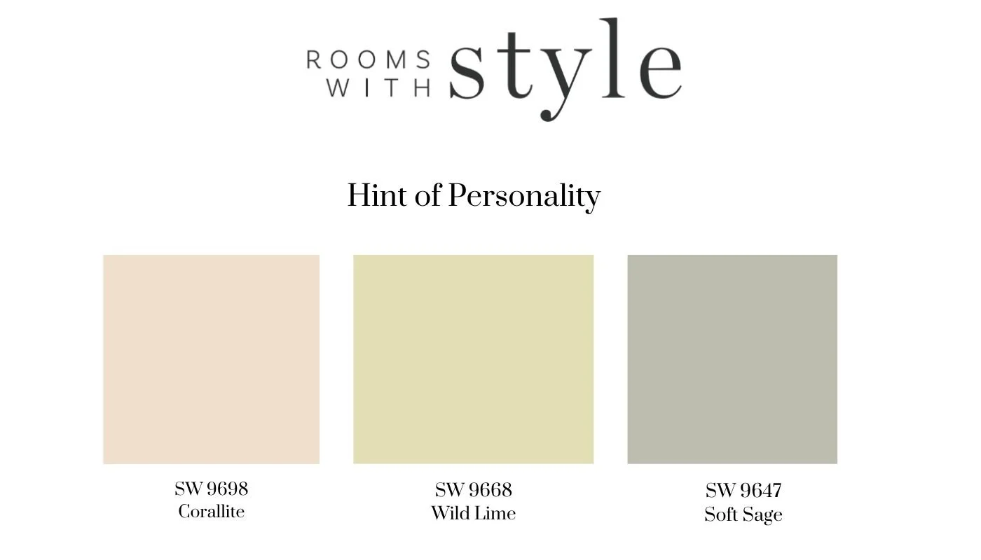
Corallite
Corallite is a muted, earthy blush that brings warmth and character without feeling overly feminine or trendy. It adds just enough color to create interest while maintaining a soft, sophisticated feel.
We love it in powder rooms, bedrooms, and on accent furniture pieces.
Wild Lime
Despite its playful name, Wild Lime is surprisingly versatile. This soft green feels fresh, organic, and calming while remaining subtle enough to function almost like a neutral.
It’s a wonderful choice for home offices, mudrooms, laundry rooms, or accent cabinetry.
Soft Sage
Inspired by nature, this gentle green creates a calm, relaxing atmosphere and pairs effortlessly with warm whites, wood tones, and natural textures.
We especially love it in bedrooms, bathrooms, and built-ins.
Our Tried-and-True Favorites
As much as we enjoy discovering new colors, there are a few Sherwin-Williams classics that have earned a permanent place on our recommendation list.
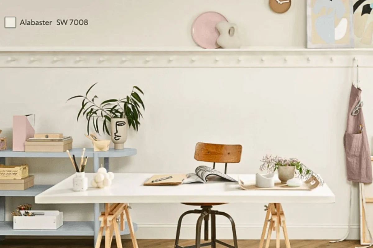
Alabaster
Alabaster remains one of the most versatile whites available. Its soft warmth prevents it from feeling cold or sterile while still providing a clean, fresh appearance.
It’s one of our most frequently recommended colors for sellers because it appeals to a wide range of buyers and complements nearly every design style.
Shoji White
Shoji White is one of our favorite warm off-whites. It offers more depth and softness than a traditional white while still keeping spaces bright and open.
We often recommend Shoji White for homes with warm wood flooring or natural finishes because it creates a beautiful balance without feeling yellow.
CITY LOFT
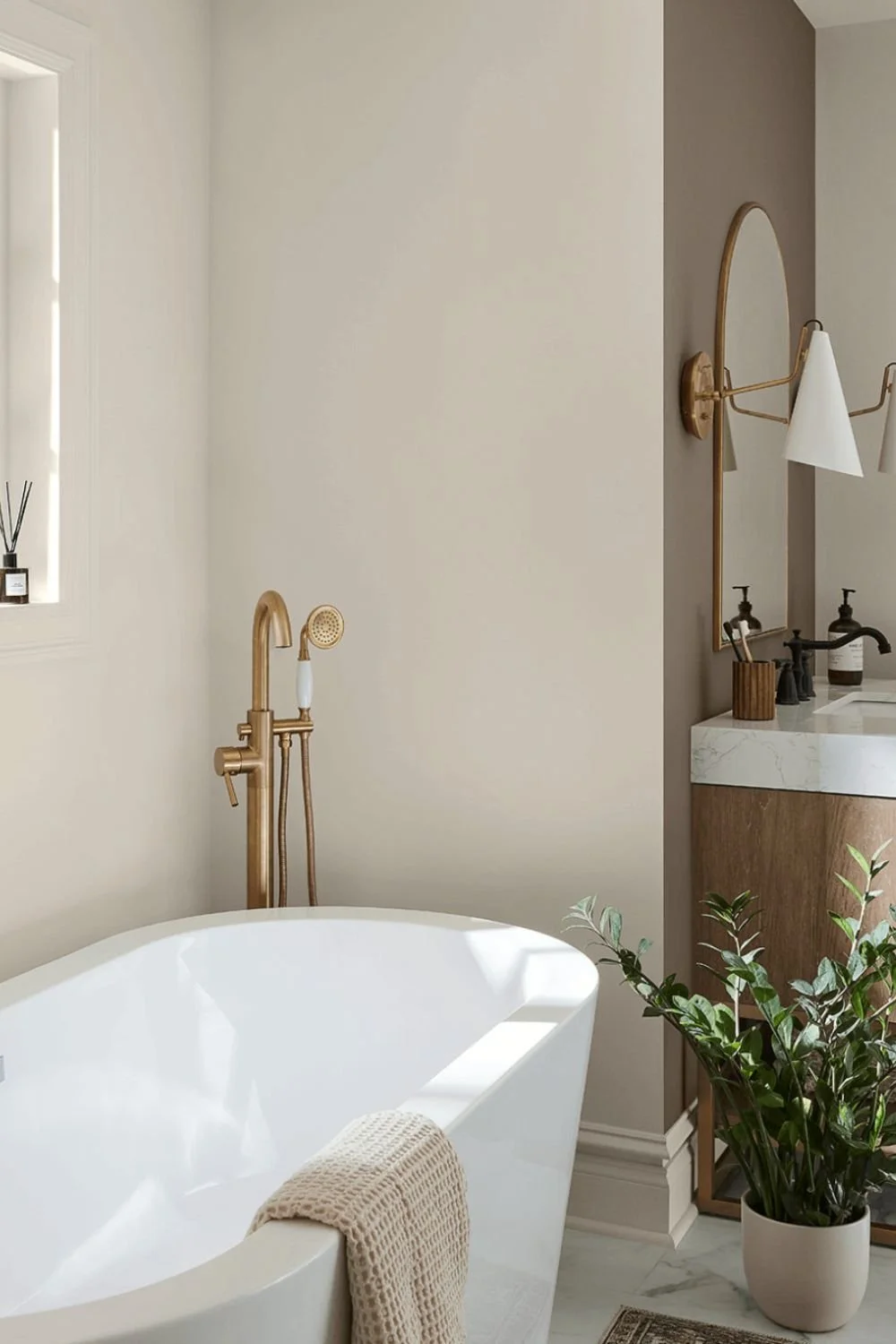
City Loft is a soft, warm off-white with subtle greige undertones that feels fresh, bright, and inviting without feeling stark or cold. It works beautifully in homes with both warm and cool finishes and can help create the light, airy feel that many buyers are looking for today. We often recommend this color for living rooms, dining rooms, kitchens, and open concept larger spaces.
Accessible Beige
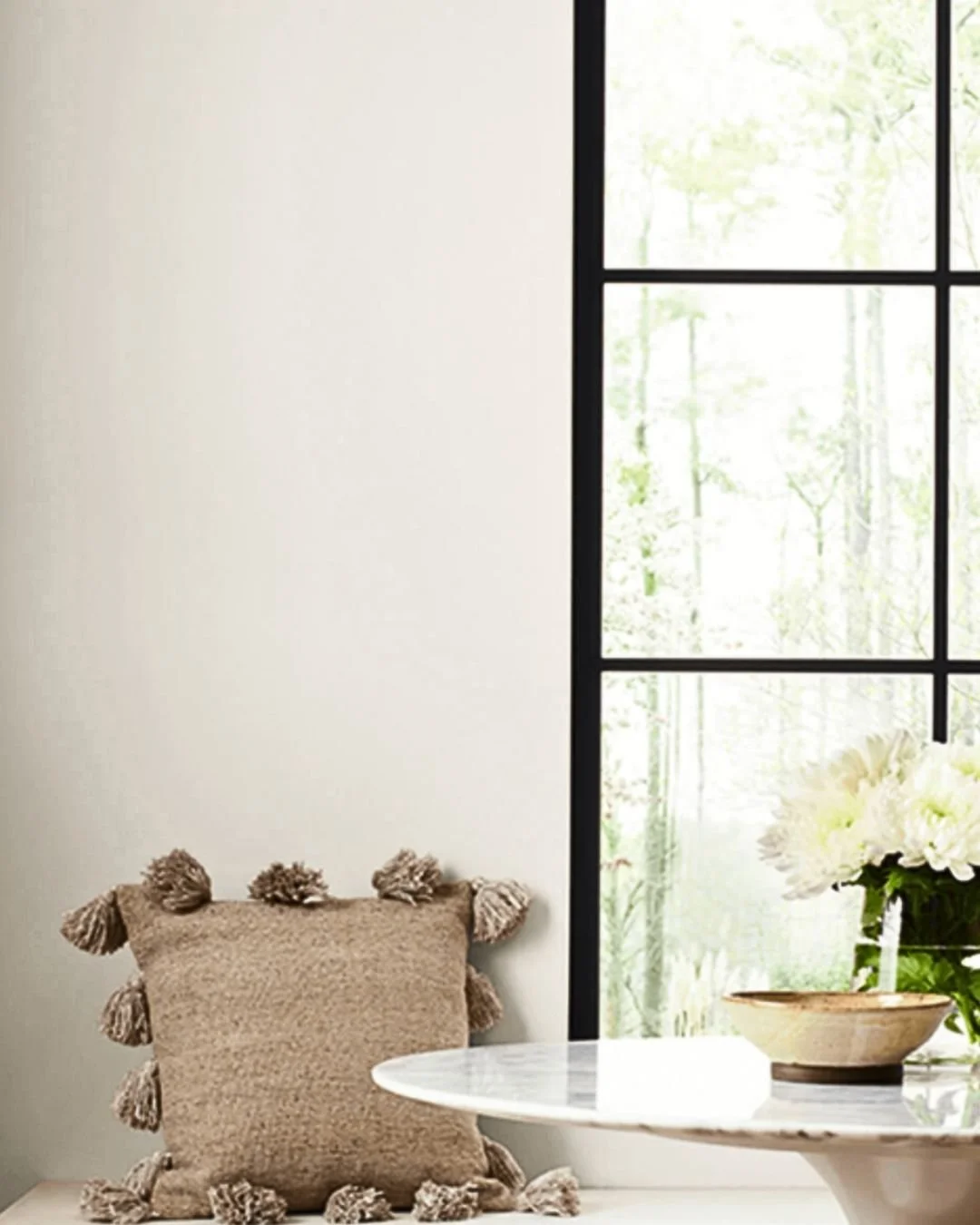
Despite its name, Accessible Beige is much more than a traditional beige. This warm greige has remained a favorite for years because of its incredible versatility.
It coordinates beautifully with a wide range of flooring, cabinetry, furnishings, and décor styles, making it one of the safest and most reliable choices for homeowners preparing to sell.
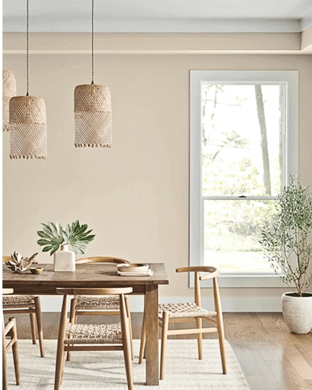
Final Thoughts
Paint is one of the simplest and most cost-effective ways to refresh your home. Whether you’re preparing to sell, updating a recently purchased home, or simply ready for a change, selecting the right paint color can completely transform the way a space feels.
This year’s favorites offer something for everyone—from the warm sophistication of Soft Suede and Dumpling, to the fresh brightness of White Sesame, to the subtle personality of Soft Sage, Corallite, and Wild Lime.
While trends will continue to evolve, colors like Alabaster, Shoji White, City Loft, and Accessible Beige remain timeless choices that consistently help homes feel warm, welcoming, and market-ready.
If you’re unsure which paint color is right for your home, we’d be happy to help. Choosing the perfect shade isn’t just about what looks good on a paint chip—it’s about finding the color that works best with your home’s lighting, finishes, and overall style.